GreenLeaf
Introducting a way for companies to communicate their commitment to protecting our world & providng eco-consious consumers a way to track their eco-friendly activitites & best practices.


My Role
Duration
August 2022 - October 2022
UI & UX Designer and Researcher
The Problem
Now more than ever, ethical businesses need to transparently show conscientious consumers what kind of effect their product or services has on the environment. In addition, environmentally-conscious consumers are looking for a way to become more educated and also hold themselves accountable while implementing green best-practices into their daily lives. How might we help ethical businesses display their policies, effect, and commitment to protecting our world while providing the consumer a method to manage their actions and activities?
The Final Solution
Through extensive user research, usability testing, and many iterations, we finally arrived at our final solution that was tailored to our users. This solution provided a method for ethical companies to effectively display their policies and commitment to protecting our world, as well as users a way to accurately track and monitor their environmentally friendly goals and activities.
Problem Statements
To begin our process, we collaborated and developed a problem statement to start our research.
“I am an environmentally conscious business. I’m trying to communicate my environmentally/socially conscious policies and activities to stakeholders, but I’m having difficulty crafting a coherent message which results in reduced user interest/buy-in to the socially conscious aspect of our business.”
In addition, we created a short list of ‘How Might We’ statements to better understand the pain points that both companies and eco-friendly users may experience.
Finally, our hypothesis, we proposed to solve the identified user problem by creating an application that allows customers to research various aspects of socially or environmentally conscious businesses’ policies or initiatives, and that allows the user to track the progress of their daily eco-friendly activities.
The Goal
There were three end goals we wanted to achieve with this application.
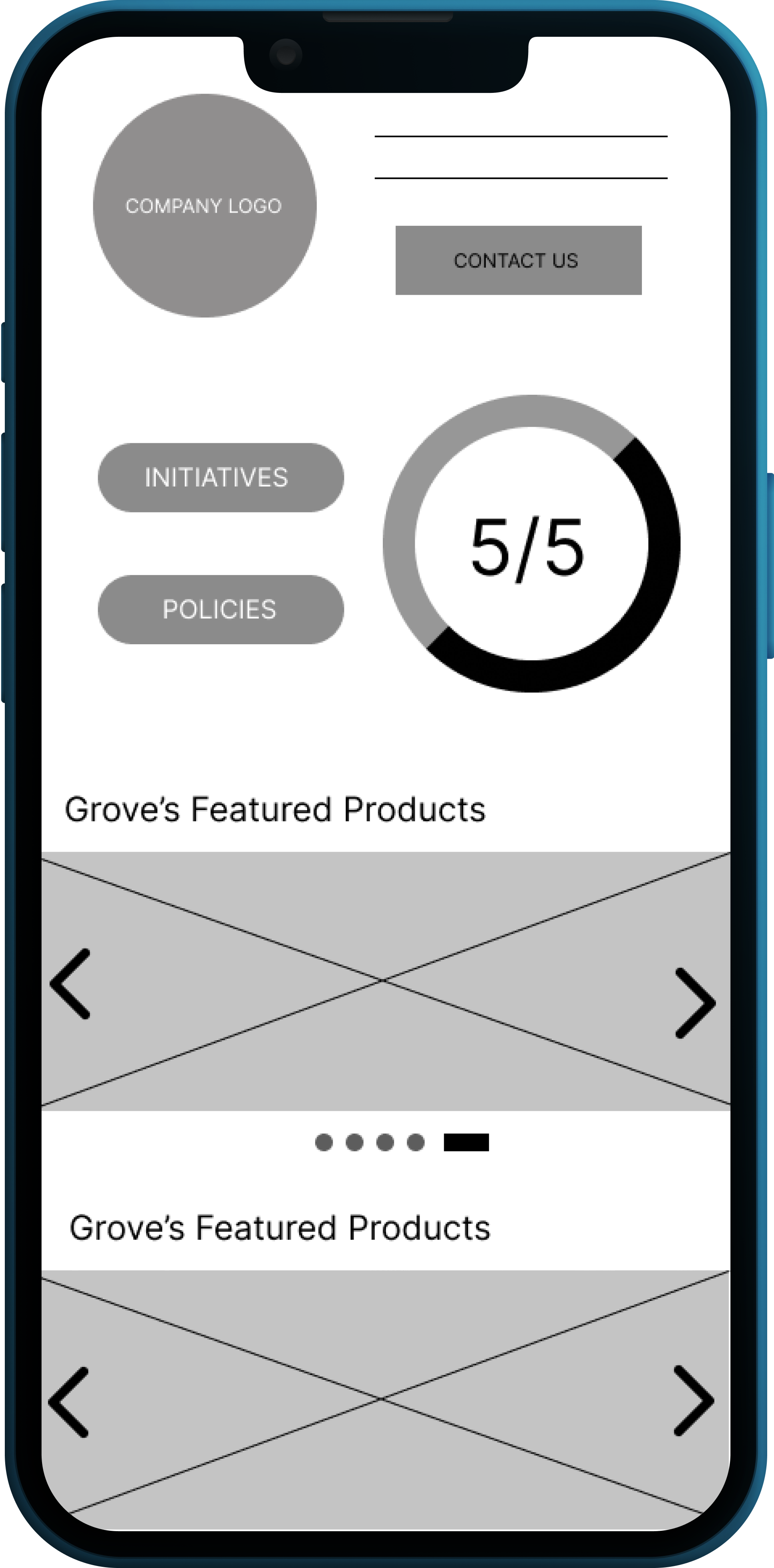
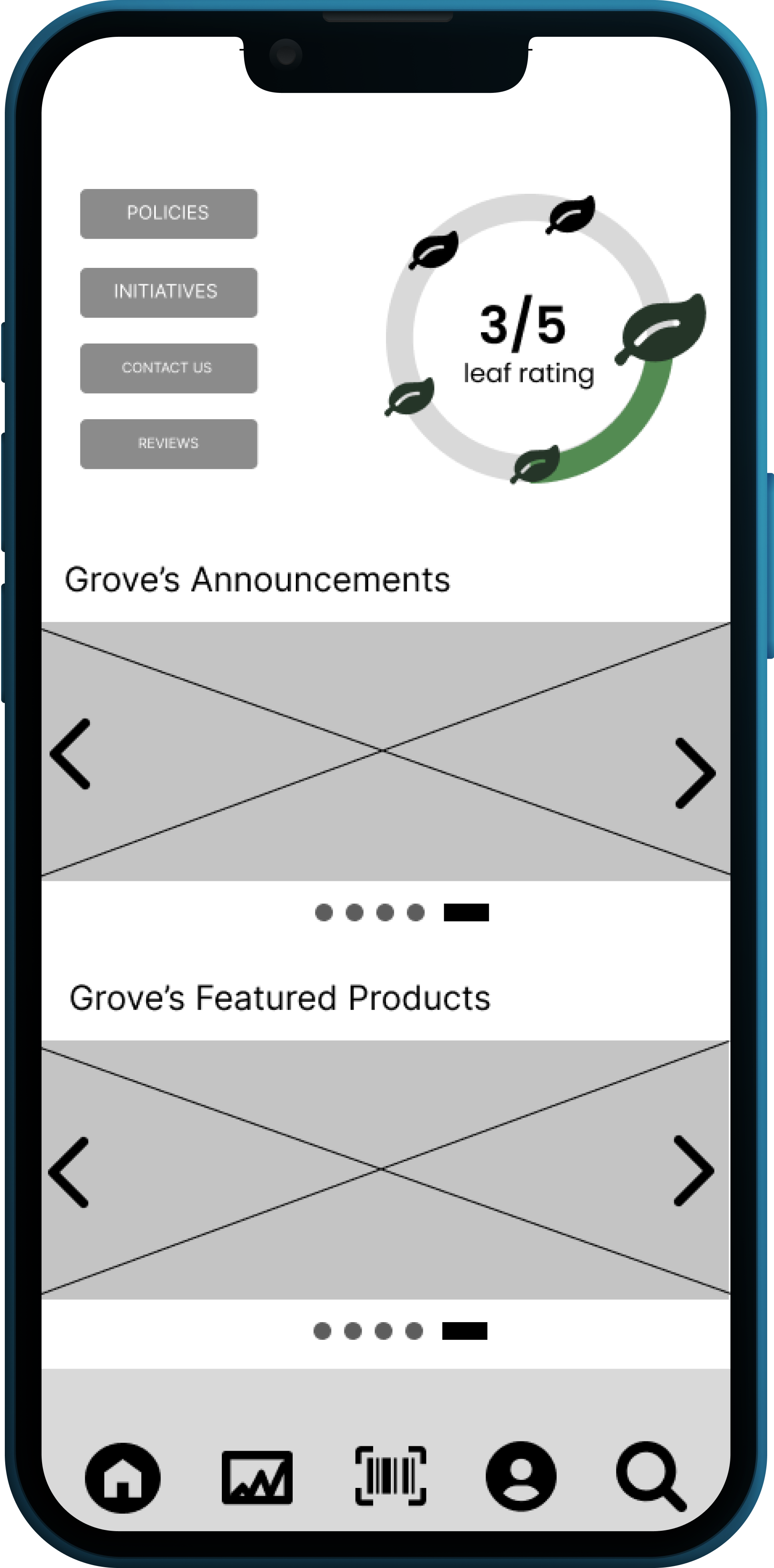
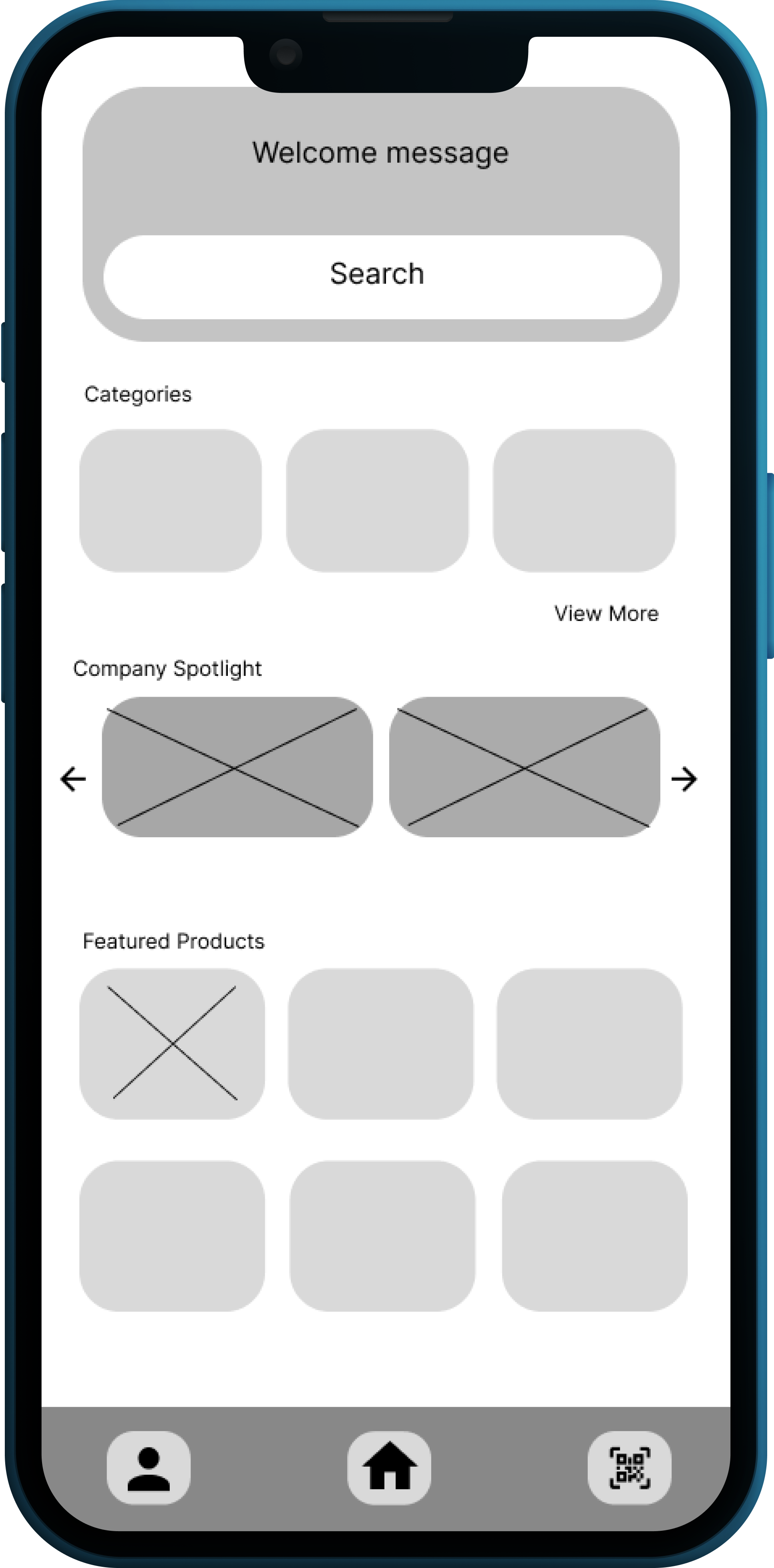
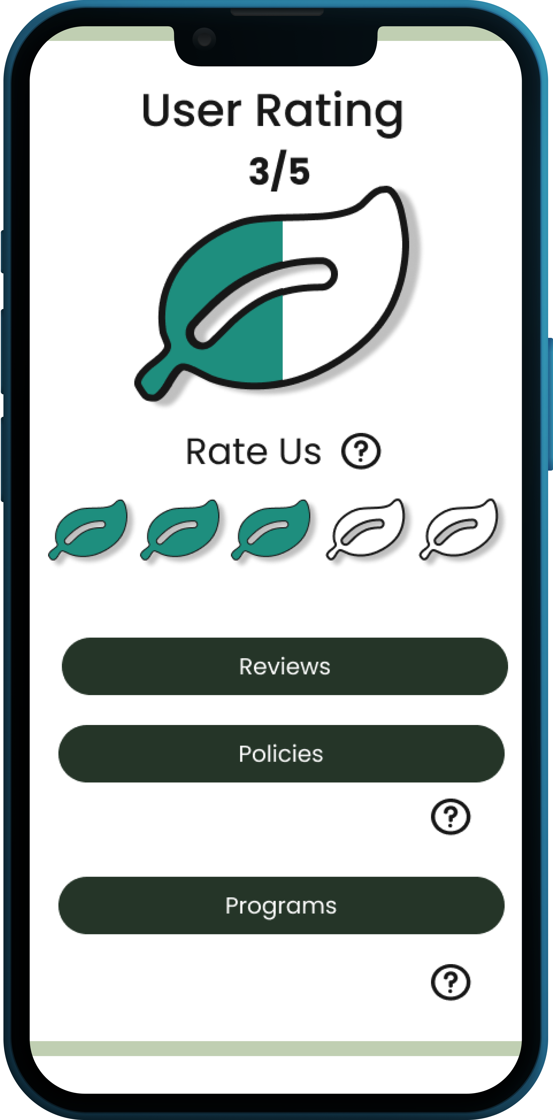
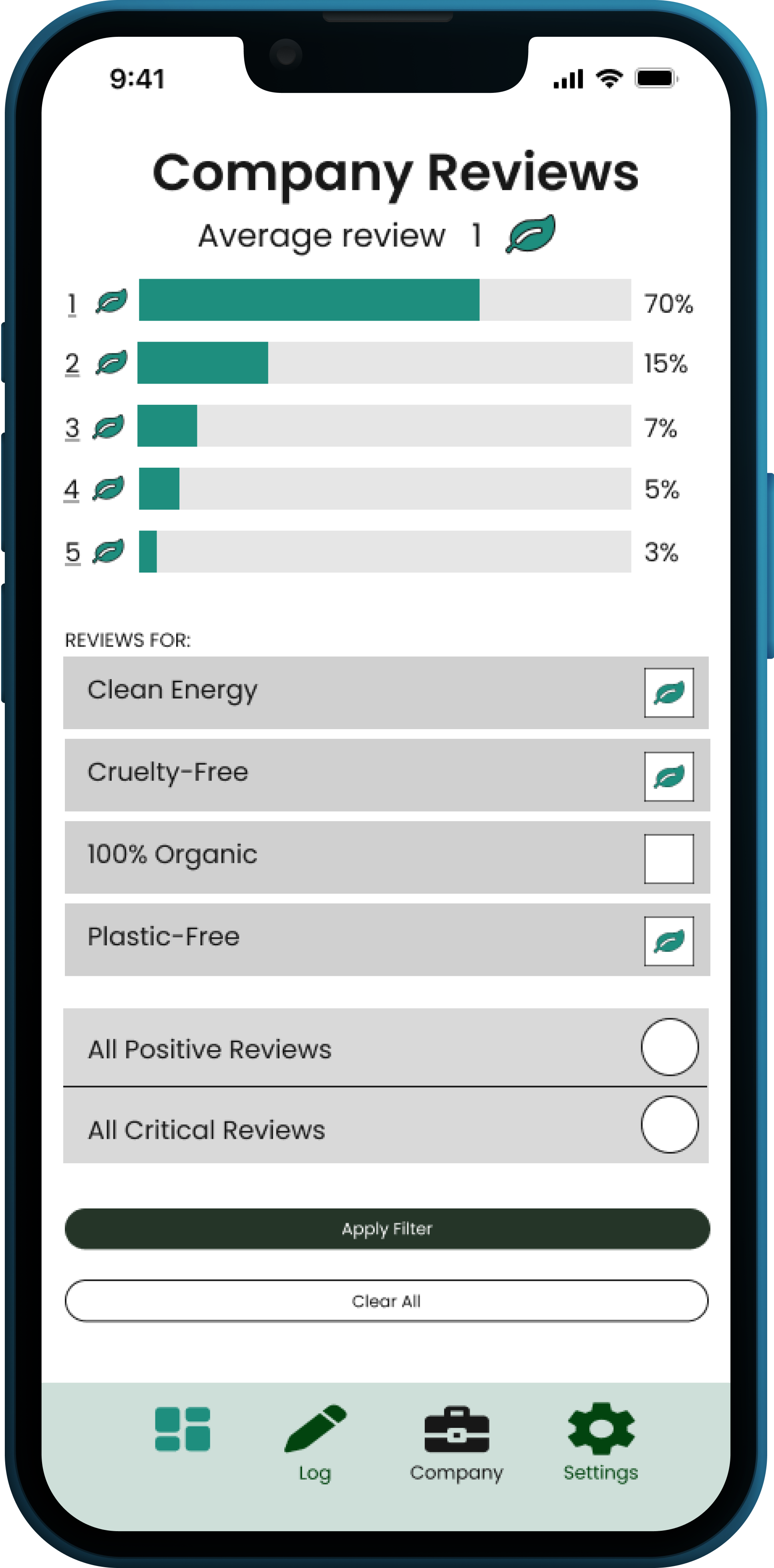
1: Quickly identify eco-friendly companies, their policies and commitment to protecting our world
Learn and understand companies’ core values
Stay informed of company updates and corporate initiatives, relating to environmental consciousness
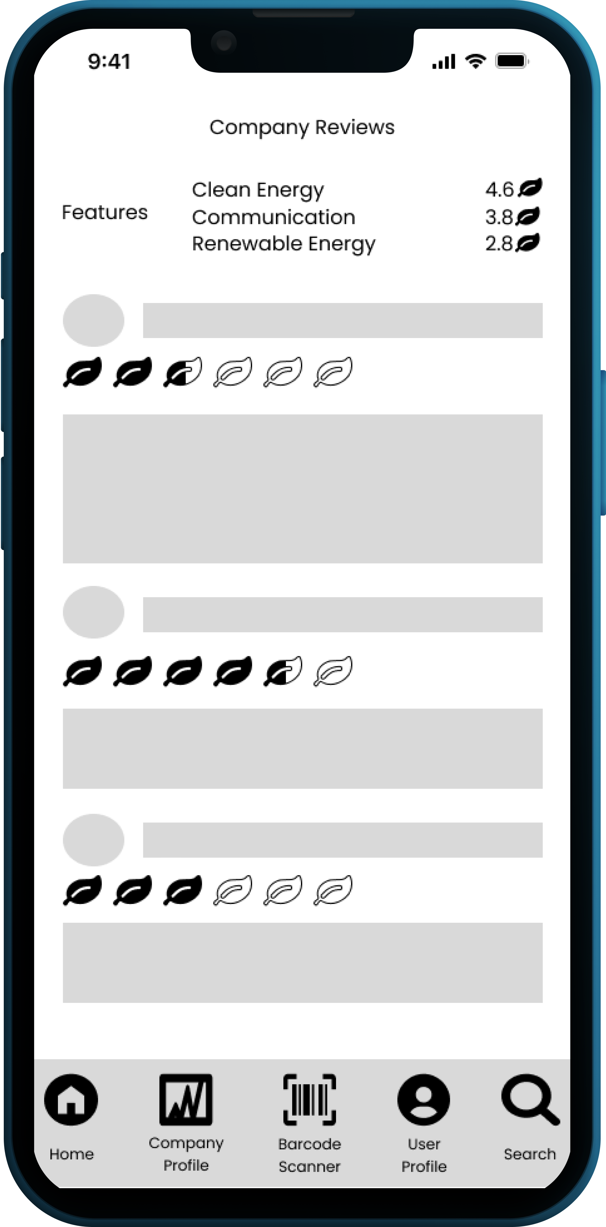
Review the transparency of companies and leave ratings based on customer experience
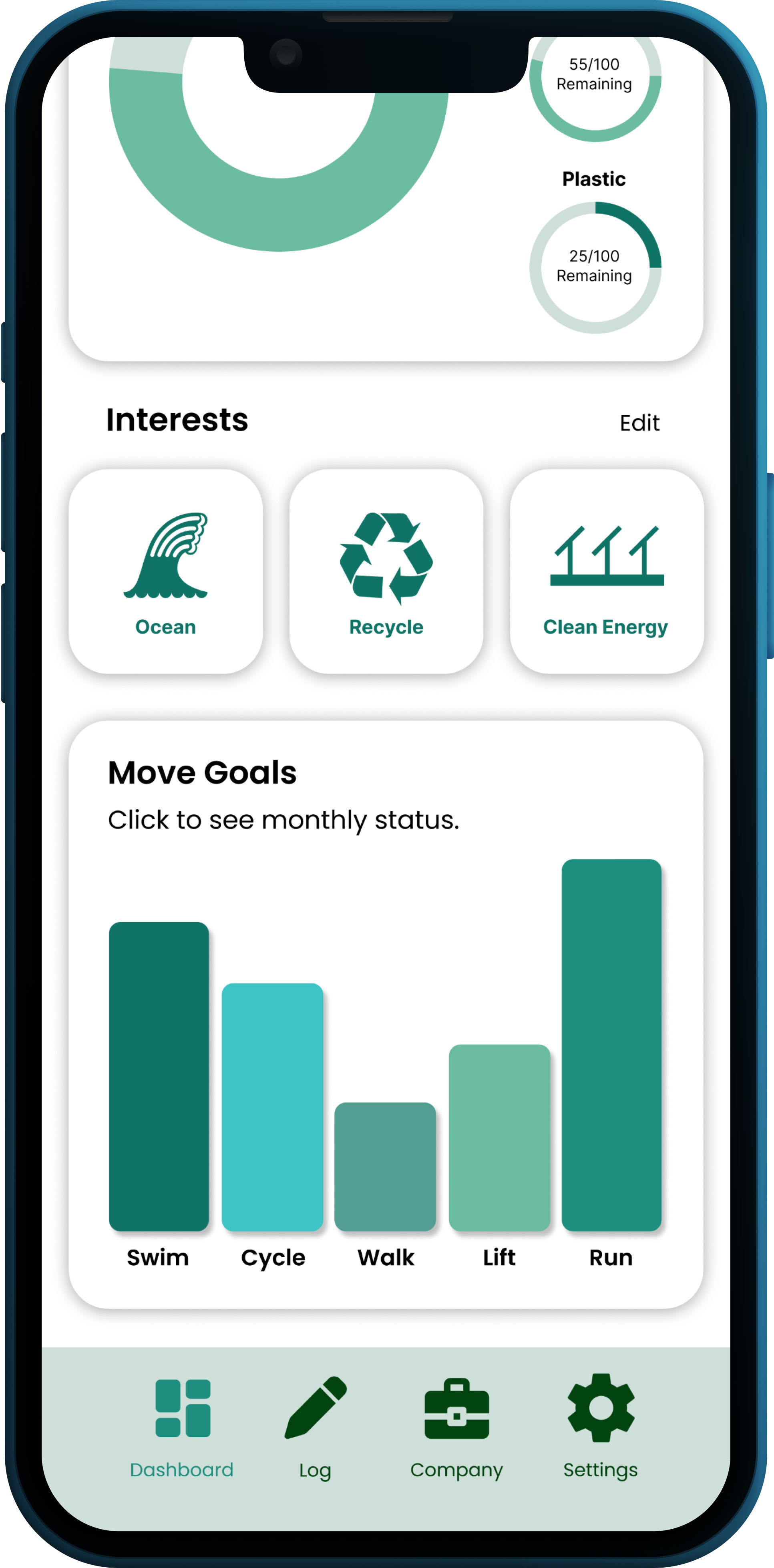
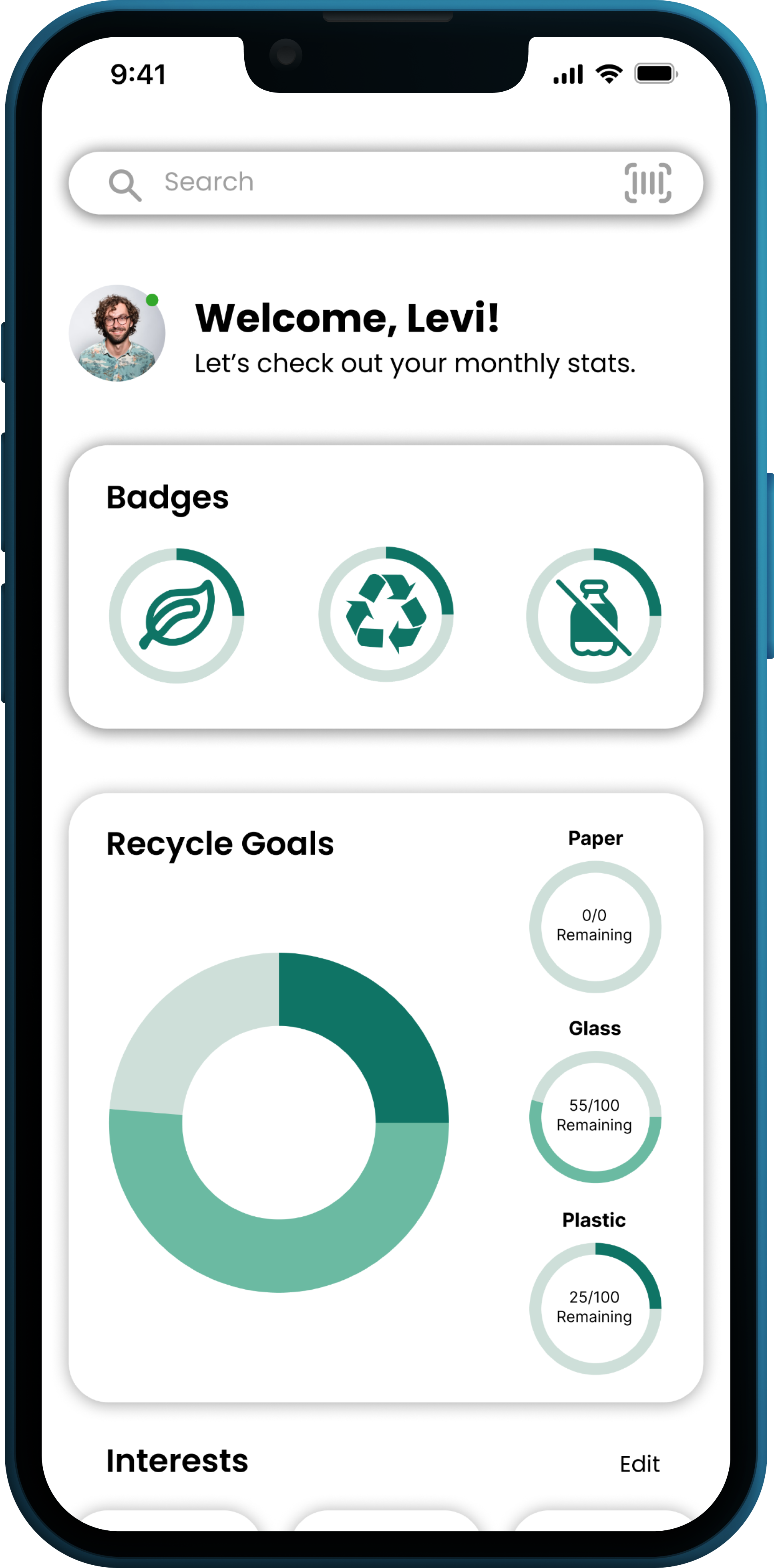
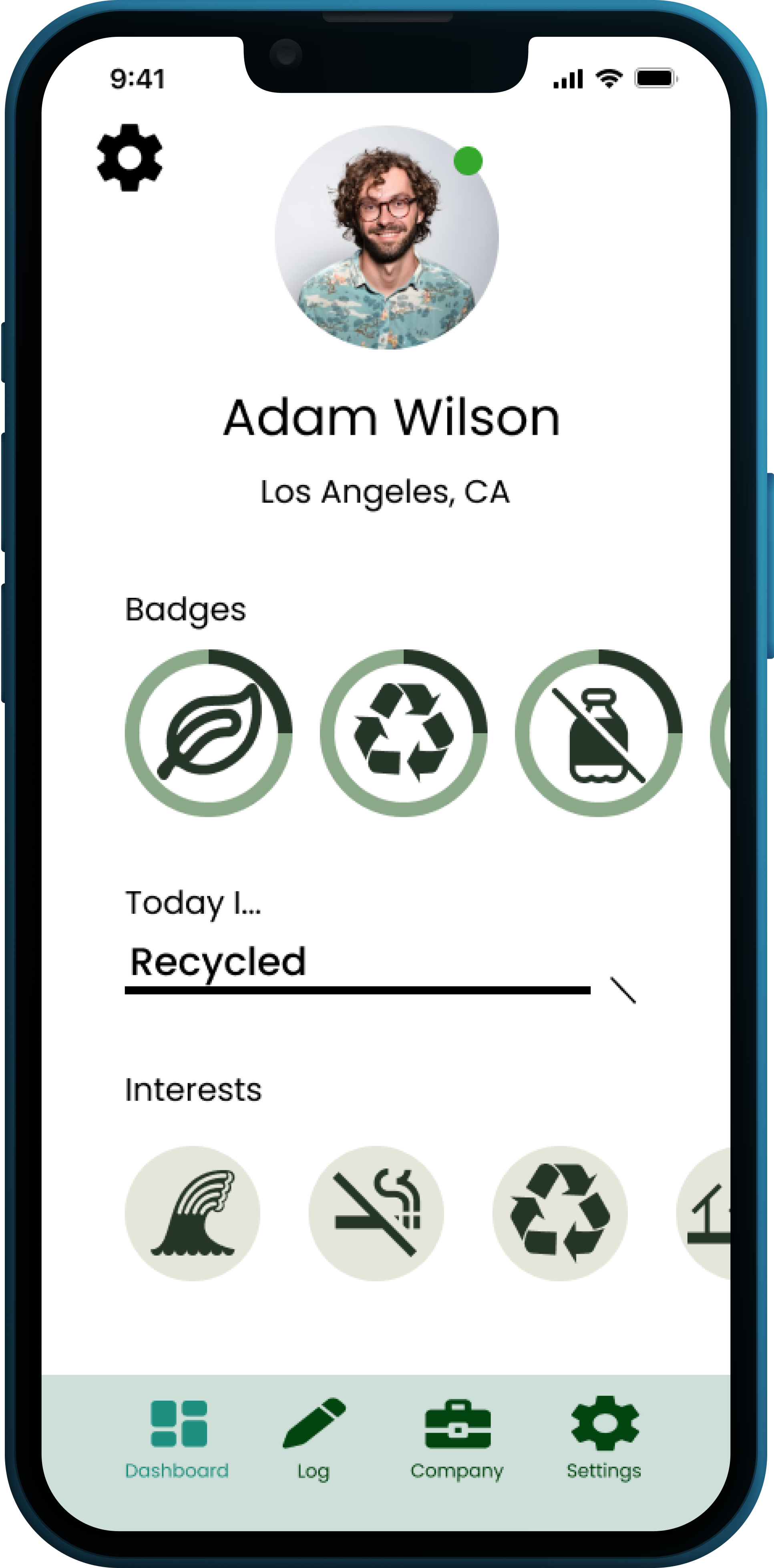
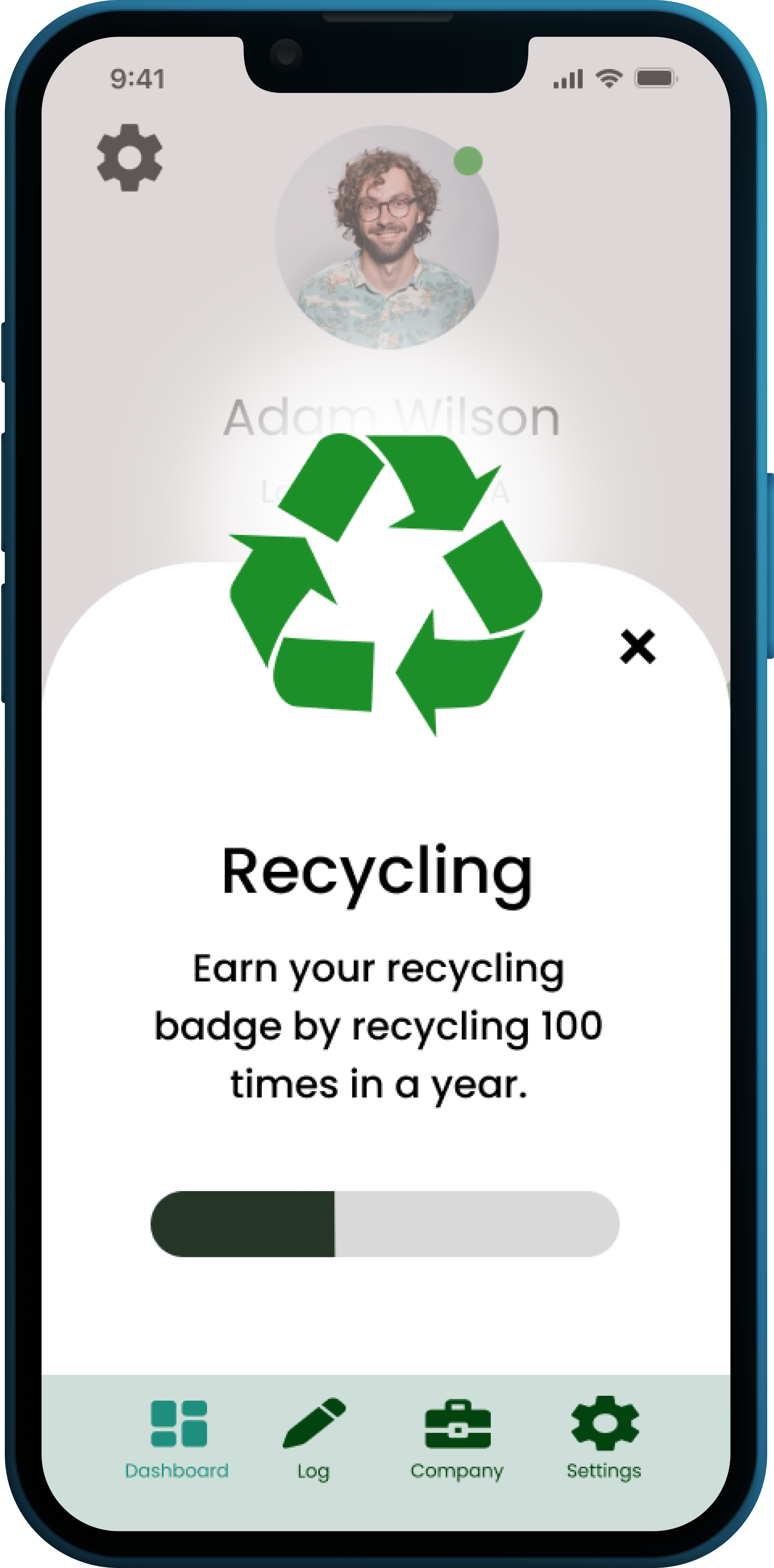
2: We wanted our users to be able to self-manage their goals
View their progress through badge system (an incentive to be used in future e-commerce feature)
Select environmentally friendly interests to customize the application for a personalized experience
Stay up-to-date with your "goals at a glance”
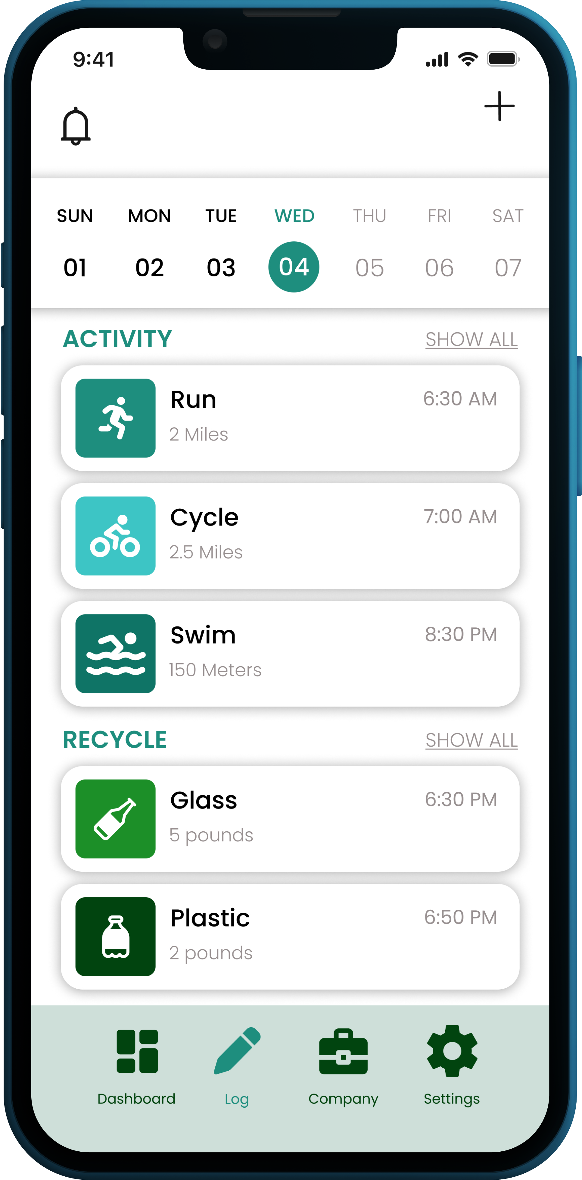
3: Log daily eco-friendly activities and track implementation of best practices into daily life
Track activities that are environmentally friendly (recycling, walking instead of driving, etc.)
Set reminders to stay active
View the dashboard to see overall progress
Research
We conducted 82 surveys and 8 interviews to learn more about our users, their wants and needs, their pain points, and their desired solutions. We wanted to better understand the importance of implementing environmentally-friendly practices into our users’ lives. We wanted to know more about how our users interacted with current products and how they currently locate information about environmental issues, and how that experience could be improved.
Through our research, we found that 100% of our users interviewed and surveyed, strongly desire a solution to track personal activities and goals. 92% of our survey participants expressed that a method to research and identify eco-friendly companies was important to them.
Iterate, Iterate, Iterate
As we began the ideation phase, we first identified the features that would be most beneficial within our application. Once those were identified, we then began sketching designs and then designing low-fidelity and mid-fidelity wireframes. We prioritized placing the content strategically within the application so that it was the most intuitive user experience. Through feedback from our users and mentors, following our low and mid-fidelty wireframes, we pivoted and incorporated a dashboard screen. This would allow users to have that ‘at a glance’ view of their interests, goals, and progress.

Low-Fidelity Wireframes
Mid-Fidelity Wireframes

Usability Testing
We conducted 15 unmoderated, remote usability tests via Maze.co. All of our participants were previous members of our case study. We tested our badge feature, user interests, and user move goals. These are all located on the dashboard page. Our 15 participants were asked to complete various open-ended tasks and answer 2 open-ended questions.
Once our study was closed, we synthesized the data and through affinity mapping, we were able to come to the following conclusions:
The scroll functionality was unclear to our users
The navigation bar remained at the bottom of the screen and that was not intuitive for our users
There was a high misclick rate, but our average success rate was 64.3%-80%.
In hindsight, our tasks could have been defined more clearly as this led to some confusion for our users
Style Tile