Mt. Hope Sanctuary is a non-profit women’s home located in central Kansas, focusing on restoration and rehabilitation. Mt. Hope Sanctuary’s main goal is to bring restoration, hope, and wholeness where there once was brokenness.
My Role
Duration
March 2022 - April 2022
Solo Designer, Graphic
The Problem
Mt. Hope Sanctuary wanted to drive more donor traffic to their website through the use of an updated visual refresh. Their previous branding was outdated and did not possess accurate brand representation.
Proposed Solution
A strong visual redesign that not only was easily identifiable and increased brand awareness and recognition but also appealed to women who may be inclined to utilize Mt. Hope’s services.
The final deliverables for this project include:
Logo redesign
Business cards
Event poster series
Social media post series
Logo Ideation
Step one was to solidify an updated logo. I wanted to explore and utilize the “mt” portion of the name, signifying a mountain, victory, hope, and courage. Mt. Hope Sanctuary firmly believes in second chances, support, mentorship, hope, and faith, so I felt this was a fitting exploration. Below is an example of my very first sketches as I explore the mountain and heart logo concept.


Next, I explored color usage. I wanted to use a color palette that felt calming and trustworthy. I wanted it to feel fresh and new, but not be too loud. I really took into consideration Mt. Hope’s mission and made sure to really encompass that emotion that may come along with a woman’s experience and journey through Mt. Hope’s program. I didn’t feel that bright colors were appropriate, or fitting for this brand.
Color Usage

Poster Design


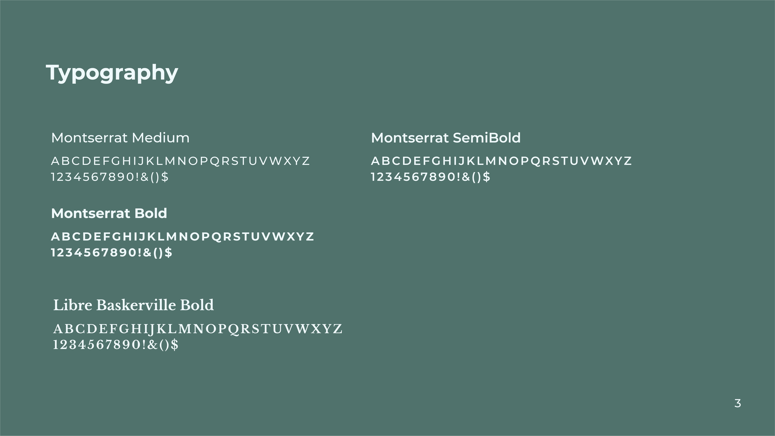
Branding Guidelines